What if donating your time, not just your money, could help charities build better digital experiences?
UX4Impact is a mobile-first platform that connects supporters with nonprofits through bite-sized research participation. I led the UX strategy and design as part of UX design program at Brainstation.

Problem Space
The Opportunity
I discovered that many supporters would gladly contribute time to causes they care about, if it were easy and meaningful.
- 70% of digital supporters said they'd take a short survey if it helped improve a charity site
- Younger donors want more interaction beyond giving
- Nonprofits need feedback to grow, but lack the tools
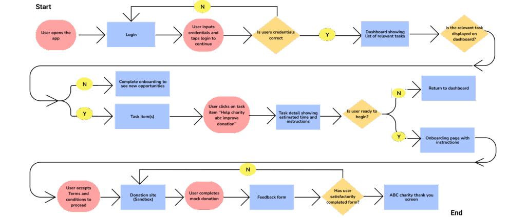
Task Flow
Sketches, Wireframes and Prototypyping
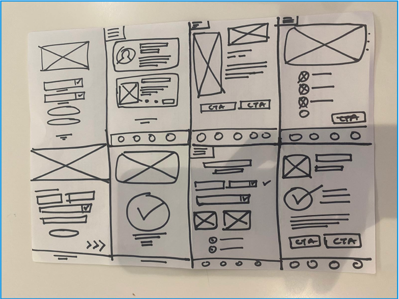
Before jumping into high-fidelity design, I started with quick hand-drawn sketches to map out the core user flow and key screens. This helped me visualise how supporters would navigate the platform — from discovering a task to completing their first piece of feedback.
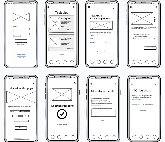
Once I had a clear direction, I used Balsamiq to translate those sketches into low-fidelity wireframes. Balsamiq was ideal for this stage because it let me focus on layout and structure without getting distracted by visuals. I iterated on multiple versions based on early feedback, testing for clarity, ease of use, and flow.
The goal here wasn’t to make it pretty, it was to make sure it made sense. And it worked: the lo-fi wireframes gave me a strong foundation to move into prototyping with confidence.
Results
Reflection
- Real user feedback didn’t just validate my ideas, it revealed blind spots I hadn’t considered.
- Staying curious, asking “why,” and being open to change helped me design with more empathy and clarity.
- AI is your companion, not the enemy. Also using tools like Balsamiq and Figma allowed me to iterate quickly and focus on what mattered most.
- The small details, wording, flow, even button placement can make or break the experience.