When “Free” isn’t really free: Sprout AI UX case study
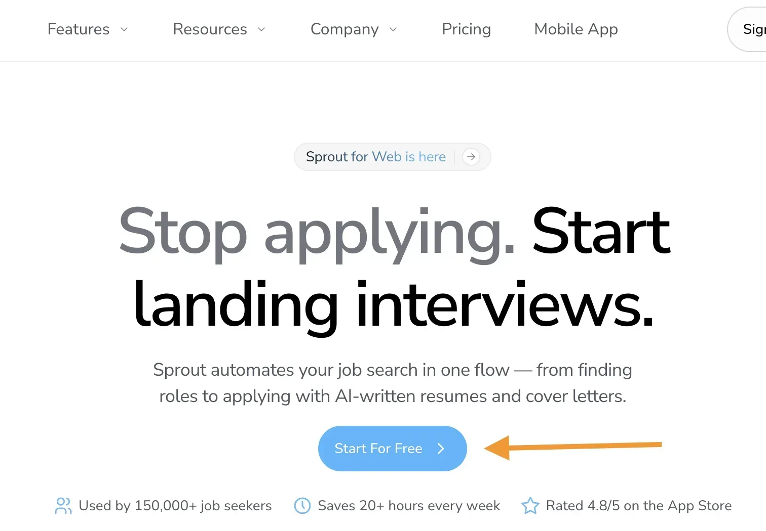
I recently came across an AI-powered job application tool while doomscrolling on TikTok. Intrigued by one of its selling proposition (Apply to jobs in one tap – I’m very skeptical of AI platforms that promise batch job applications in a Jiffy), I clicked “Start for Free.” After answering onboarding questions and creating an account, I hit a wall: pay or refer 3 friends. No free access. No trial mentioned. Just a gate.
The app in question? Sprout (previously Prep AI). Credit to their marketing team for the influencer engagement tactic on TikTok, it worked. But the signup flow? Different story.
And look, it’s bad enough that most “free trials” require credit cards upfront (which we conveniently forget to cancel 🙄). But at least those give you something to try first.
UX Analysis
This violates Jakob’s Law (users expect patterns from other sites – explained here by Nielsen Norman Group) and employs a Bait-and-Switch dark pattern as defined in dark pattern research. When CTAs promise “free,” as in Screenshot 1, users expect some level of functionality without payment or social currency.
The referral wall in the screenshot above is particularly problematic:
No upfront transparency about costs or requirements
Sunk cost fallacy: Users invest time in setup before discovering the gate
Referral gate: Requires friends to sign up before you get credits
Why This Matters
For potential Sprout users, this wastes time and erodes trust. Job seekers are often financially stressed and emotionally drained, this pattern feels extractive, not helpful.
For the business, App Store reviews tend to reflect user frustrations. One user noted:
“They make you go through all the questions and account setup before telling you that you have to pay”
Product teams need to design with empathy, not exploit urgency.
Better approach + Key takeaway
If hired for a day, I’d:
Change the CTA to reflect reality ("Start 7-Day Trial" or "Get 5 Credits via Referrals")
Show pricing before account creation, and offer 1-2 free features as genuine try-before-you-buy.
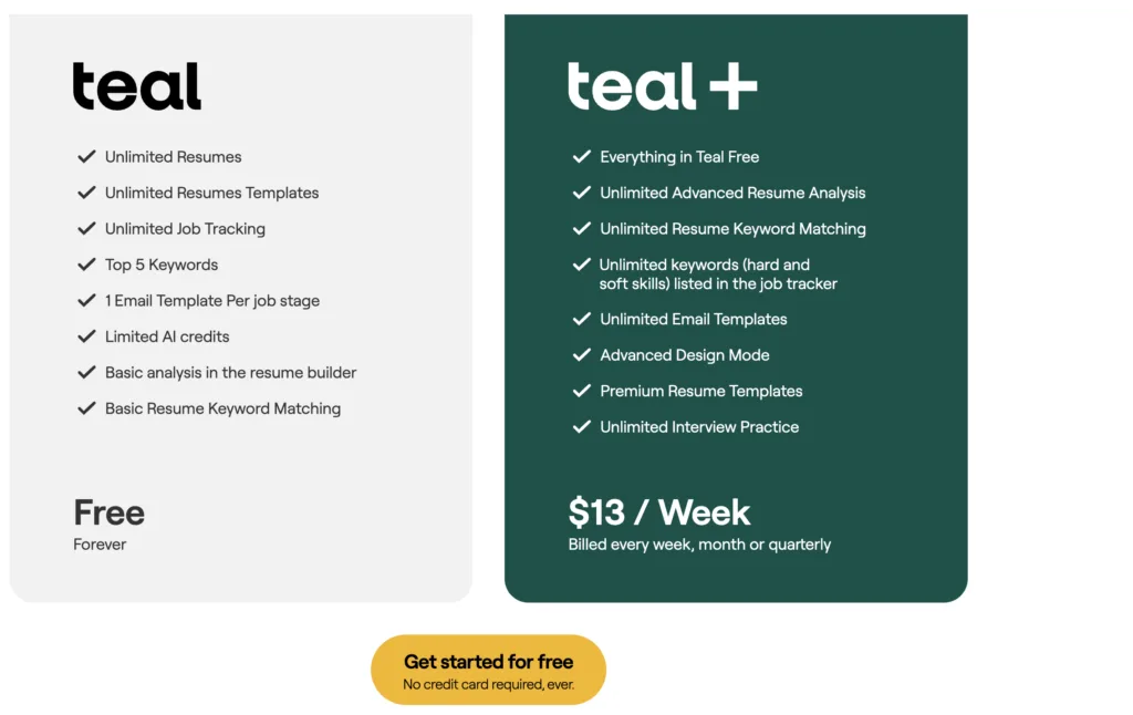
Apps like Teal and Jobright do this well: free tiers, free credits, access to some AI features and upfront pricing with clear trial terms.
What am I trying to say here?
Transparency isn’t optional, it’s foundational. If your business model requires payment or referrals, say so before users invest time. Deferred honesty isn’t strategy; it’s a conversion killer.
Have you experienced similar bait-and-switch patterns? Drop your stories below.
Further reading:
The Cookie Consent Paradox: Learn how the consent-or-pay model creates similar forced choices after users are already invested.
Deceptive patterns: Tricks used in websites and apps that make you do things that you didn’t mean to, like buying or signing up for something