WhatsApp Web Notifications: A Summary-State Mismatch
TL;DR
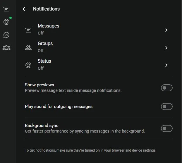
WhatsApp Web’s notification menu labels Messages, Groups, and Status as “Off” but sound can still be toggled on inside each one. The parent label doesn’t reflect the real state of the sub-settings. The fix? A compound status indicator (e.g. “Notifications off · Sound on”) that tells the whole truth at a glance.
The user complaint
I opened WhatsApp Web on my desktop at work and did a quick scan of the notification settings to silence things before a meeting. Messages, Groups, Status – all labelled “Off.” Sorted, I thought. Ten minutes into the meeting, my laptop blasted a notification sound across the room. Turns out, inside the Messages sub-menu, “Play sound” was quietly toggled on. The parent label said one thing; the reality said another. And as I sat there, red-faced, fumbling for the mute button, I thought to myself – this calls for… drumroll 🥁 …a proper UX teardown.
UX analysis
In my opinion, this goes against Nielsen’s heuristic #1: visibility of system status which acknowledges that the interface should always keep users accurately informed about what’s happening. It also breaks the match between system and the real world heuristic, because “Off” in everyday English doesn’t mean “mostly off, except for sound.” That’s not pedantry, that’s just what the word means.
There’s also a progressive disclosure issue. Hiding sub-options behind a tap is fine, that’s good design but only if the parent label honestly summarises what’s underneath. WhatsApp gets the disclosure right and the summary wrong.
Why this matters
Here’s the thing: when a label doesn’t reflect reality, trust quietly erodes. And as my meeting moment shows, the cost isn’t always minor friction, sometimes it’s public embarrassment as was my case 🙁 . Users in that scenario don’t blame themselves; they blame the app. For Meta, it’s a small but compounding dent in user confidence, especially in a settings area people only visit when something is already wrong.
What I would consider
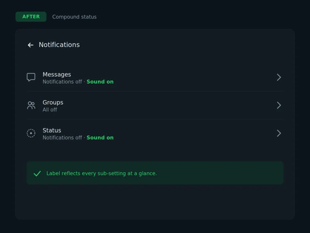
Replace the binary “Off” label with a compound status indicator that reflects all sub-settings. Something like:
Messages — Notifications off · Sound on *
Groups — All off *
Status — Notifications off · Sound on
iOS Settings does this beautifully (think “Wi-Fi: Connected” or “Bluetooth: On”). Two extra words. Zero ambiguity. Nobody embarrassed in a meeting. A summary label should never conceal what’s underneath it. If the parent says “Off,” everything inside should be off or the label needs to tell the fuller story. Has this ever happened to you? That moment when you thought you’d silenced an app, only for it to betray you in the worst possible setting, a meeting, a cinema, a quiet train ride? Drop your story in the comments. I’d love to hear which apps are the worst offenders, and which ones get the summary-label pattern right.
Further reading:
The Cookie Consent Paradox: Learn how the consent-or-pay model creates similar forced choices after users are already invested.
Deceptive patterns: Tricks used in websites and apps that make you do things that you didn’t mean to, like buying or signing up for something